
Confession time: I once rage-quit a calorie-tracking app because logging a banana took more steps than peeling the actual fruit. If you’ve ever wanted to throw your phone across the room (gently, we hope), you’re not alone. But what if your mobile app could be the reason someone *smiles* at their phone instead? Let’s explore how small, thoughtful tweaks can skyrocket your mobile app’s user experience, using some tales from the trenches and a few questionable metaphors.
Heroic Simplicity: The Art of Making People Want to Tap
Let’s face it: nobody downloads your mobile app hoping for a finger workout. Yet, here we are, rage-quitting after the fourth “just one more step” screen. If you’ve ever watched a user’s face morph from hope to horror as they try to check out, you know the pain. It’s the marathon nobody trained for—except maybe your competitor’s mobile app, which just won a new fan.
Minimalistic Design: Less Is More (and More Tappable)
Minimalistic design isn’t just a fancy way to say “we forgot to add features.” It’s about stripping away the clutter so users can actually see—and tap—the stuff that matters. When you highlight essential calls-to-action, you’re not just making things pretty; you’re making them obvious. Remember: users spend most of their time on other sites (thanks, Jakob Nielsen), so don’t make them re-learn the wheel. Keep it simple, keep it familiar, and keep it vertical—because thumbs love a good single-column scroll.
Touch Targets: Measured in Millimeters, Appreciated in Smiles
Ever tried tapping a button so tiny you needed a stylus—or a microscope? Don’t be that mobile app. Touch targets should be 7-10mm for most fingers. It’s science (and common sense). When users hit the right button the first time, they don’t cheer—but they also don’t curse your name. Bonus points: make your font size at least 11-13pt, so nobody’s squinting or pinching to zoom.
Single-Column Layouts: For Vertically-Inclined Thumbs
Multi-column layouts on mobile are like speed bumps on a racetrack—annoying and unnecessary. A single-column, vertical design fits small screens best and keeps navigation seamless. It’s the difference between a smooth elevator ride and a game of hopscotch. Your users’ thumbs will thank you, even if they never say it out loud.
The Myth of the Hamburger Menu: Is Your Navigation a Secret Society?
Hamburger menus: mysterious, elusive, and often ignored. If your navigation is hidden like a secret handshake, don’t be surprised when users get lost. Navigation should be intuitive—show 3-5 options above the fold for clarity. More than that, and you’re just inviting confusion (and possibly a rage-quit).
Real Tale: The “One More Step” Meltdown
Picture this: a user, coffee in one hand, phone in the other, ready to buy. But your checkout process? Five screens deep, each with a new surprise. By step four, their coffee’s cold and their patience is gone. They quit, uninstall, and tell their friends. True story. Don’t be that mobile app.
Minimalism vs. Clutter: A Quick Comparison

| App Type | Touch Target Size | Steps to Task | Menu Type |
|---|---|---|---|
| Minimalistic | 7-10mm | 2 | Visible Tabs |
| Cluttered | 3-5mm | 5+ | Hamburger |

Responsiveness Is (Almost) Everything: Performance Without The Panic
Let’s face it: in the wild world of mobile app design, nothing sends users running faster than a slow, unresponsive mobile app. If your mobile app makes people wait, they’ll be gone before you can say “evil spinning wheel.” Performance optimization isn’t just a nice-to-have—it’s survival. Let’s take a look at the most notorious app performance sins and how to avoid them, so your users never have to panic-tap their screens in frustration.
The Hall of Shame: App Performance Sins
| Sin | What It Looks Like | Quick Fix |
|---|---|---|
| Slow Load Times | Staring at a blank screen for 4+ seconds | Compress images, lazy-load content, optimize API calls |
| Laggy Transitions | Choppy animations, delayed screen changes | Use hardware-accelerated animations, minimize heavy scripts |
| Evil Spinning Wheels | Never-ending loading indicators | Cache smartly, prefetch data, show skeleton screens |
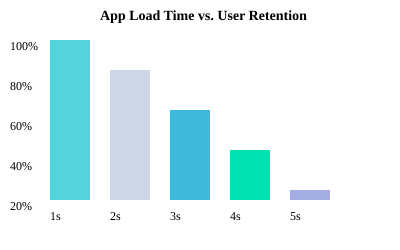
Pro tip: If your mobile app takes longer than 3 seconds to load, you’re losing users. In fact, every extra second of load time can drop engagement by about 7%. Ouch.
The Misunderstood Brilliance of Responsive Layouts
Responsive design isn’t just about looking pretty—it’s about making sure your mobile app feels right, whether it’s crouched in someone’s pocket (hello, 4-inch phone) or lounging on a 12-inch tablet. A truly responsive layout adapts to any screen, minimum 375px wide, so users never have to squint, pinch, or scroll sideways like they’re solving a puzzle.
- Use flexible grids and scalable images
- Test on a universe of devices (emulators are your friend)
- Keep touch targets big enough for human thumbs, not just elves
Myth-Busting: Faster Apps Don’t Mean Fewer Features
There’s a myth that performance optimization means stripping your mobile app down to the digital equivalent of a potato. Not true! The real secret is smarter, lighter code. Trim the fat: remove unused libraries, minify assets, and only load what’s needed, when it’s needed. Your users get all the features—just without the lag.
Quick Wins: Load Time Trims & Asset Management
- Compress images and SVGs (your users’ data plans will thank you)
- Implement clever caching strategies for assets and data
- Prioritize above-the-fold content so users see something instantly
- Use skeleton screens or progress bars to keep users calm and informed
Steve Jobs: “Design is not just what it looks like and feels like. Design is how it works.”
Chart: Load Time vs. User Retention
Remember: Mobile UI design is about performance without panic. Keep it fast, keep it responsive, and your users will keep coming back for more.

Beyond Pretty: Making Every User Feel Like an Insider (Even Grandma)
Walk a Mile in Someone Else’s Shoes: Why Accessibility Isn’t a ‘Nice-to-Have’
Let’s face it: if your mobile app only dazzles the 20/20-vision crowd with ninja thumbs, you’re missing the point of user-friendly design. Accessibility features aren’t just a checkbox for compliance—they’re the secret sauce that makes everyone, yes, even Grandma, feel like a tech insider. Imagine your mobile app through the eyes of someone with low vision, shaky hands, or who just prefers bigger text after a long day. Suddenly, mobile UI UX best practices aren’t just about looking good—they’re about feeling welcoming.
Screen Readers, Color Contrast, and the Unsung Hero—Adjustable Font Sizes
You know what’s cooler than a slick animation? A button that actually tells a screen reader what it does. Accessibility features like screen reader support, high color contrast, and adjustable font sizes (at least 11-13pt for legible text!) are the real MVPs. Yet, about 35% of top 1000 mobile apps still skip robust accessibility. That’s a lot of users left squinting, guessing, or just giving up.
- Screen readers: Label every icon and button. If your mobile app sounds like a robot reading hieroglyphics, it’s time to fix those labels.
- Color contrast: Don’t make users play “guess the button.” Use high-contrast colors—your colorblind users will thank you (and so will everyone using their phone in sunlight).
- Adjustable fonts: Let users bump up the text size. Your mobile app shouldn’t require a magnifying glass or a trip to the optometrist.
Small Tweaks, Big Difference: A Hackathon Hero’s Tale
Here’s a real-world win: At a hackathon, one developer added a simple colorblind mode toggle. Suddenly, a whole group of users could finally distinguish between “success” and “error” messages. That tiny tweak? It became a lifeline for thousands. Sometimes, the smallest accessibility features have the biggest impact.
Draw the Line—Literally: Accessibility Adoption in Numbers
Let’s get visual. Here’s how the industry stacks up on mobile UI UX best practices for accessibility:
| Feature | Best Practice | Industry Adoption |
|---|---|---|
| Font Size | 11-13pt | Varies (often neglected) |
| Robust Accessibility Features | Required | 65% of top 1000 mobile apps |
| Proper Color Contrast | High Contrast | 52% |
That means nearly half of mobile apps still leave users behind. Ouch.
Accessibility Is More Than Compliance: It’s About Dignity and Inclusion
When you build with legible text, smart visual elements, and thoughtful accessibility features, you’re not just ticking boxes. You’re giving every user—regardless of age or ability—a seat at the table. Or, as Whitney Quesenbery puts it:
“A usable interface for everyone is a win for the business.”
So, next time you’re tweaking your mobile app, remember: the best user-friendly design doesn’t just look pretty. It makes everyone feel like an insider—even Grandma.

From Feedback to Friendship: Why User Opinions Aren’t Optional
Let’s face it: you can spend months perfecting your mobile app’s navigation, smoothing out every pixel, and running it through a gauntlet of performance tests. But sometimes, all it takes is one unicorn-obsessed user to spot the rainbow-colored disaster you never saw coming. True story: a major banking mobile app nearly lost thousands of users because their “Confirm Transfer” button was hidden behind a decorative unicorn sticker during a limited-time promo. One review—“I love unicorns, but I love my money more. Please let me transfer it!”—saved the day. That’s the magic of User Feedback Integration.
Here’s the thing: you’re not a mind reader (unless you are, in which case, why are you reading this?). So, stop assuming you know what users want. Ask them! The best mobile app UX best practices start with genuine curiosity. In-app surveys, feedback widgets, and user interviews aren’t just fancy add-ons—they’re your direct line to the people who actually use your mobile app. Want to know why users keep tapping twice when once should do? Just ask. Want to know why your navigation feels like a maze? Ask again. The more you ask, the more you learn—and the more your users feel heard, valued, and, dare we say, a little bit loved.
But don’t just collect feedback and let it gather digital dust. The real magic happens when you act on it. Data doesn’t lie: top-performing mobile apps respond to 70% of user feedback incidents within 24 hours, and 42% of major mobile app updates are prompted by user suggestions. That’s not just good manners; that’s good business. When users see their feedback turn into real changes, they become more than customers—they become fans, advocates, and sometimes even friends (or at least, less likely to leave you a one-star review).
Julie Zhuo said it best: “Your most unhappy customers are your greatest source of learning.”
Let’s take a look at how integrating user feedback leads to iterative improvements in mobile app UX. Here’s a quick table showing the top changes made after listening to users:
| Feedback Source | Change Implemented | Impact |
|---|---|---|
| In-app survey | Streamlined login process | +18% user retention |
| Feedback widget | Added dark mode | +25% session time |
| User interview | Improved accessibility features | Higher ratings from visually impaired users |
| App store review | Fixed “double tap” bug | +0.7 star rating |
So, next time you’re tempted to skip the feedback step, remember: user opinions aren’t optional. They’re the secret sauce that turns a good mobile app into a great one. By making feedback a core part of your mobile app UX best practices, you’re not just building a better product—you’re building a community. And who knows? Maybe your next unicorn-obsessed user will save your mobile app from disaster, too.
TL;DR: Spoiler alert: Mastering mobile UX is all about empathy, keeping things snappy, and owning up to those tiny details that matter most. Happy users equal loyal fans and five-star reviews. Nifty features mean nothing if your mobile app frustrates people—focus on seamless navigation, fast performance, and honest, ongoing feedback loops. Now go forth and de-clutter that UI! mobile apps
